Friday, 29 March 2013

Double Page Spread Analysis (4)


This double page spread from DJ magazine has some conventional and unconventional techniques used throughout. The article has a small photo just before it starts and this is getting more and more used by editors because it shows the person getting interviewed at work or a reaction to a question, this causes the consumer to look at it and see that the person is like everyone else and it shows that they are no different. The quote on the picture is something that has been used for years now as it shows a bit of information that tries to make the consumer read the article instead of just skipping over it like what some people seem to do when they see an article that is a lot of writing.

Some unconventional techniques used in the title going over the two pages but the photo isn't. This is usually the other way around as it the picture should be the main attraction so that should be overlapping the middle of the page and the title of the article should just be on one as it should be just over the article. This is unconventional and may lose me marks so I want be using this technique.

I plan on taking the idea of the image before the article but change its position to show a reaction from one of questions I will ask. The quote is something I will definitely use because it makes the double page spread look a lot more professional and it will improve my marks.

Saturday, 23 March 2013

Contents analysis (4)


This contents page from Mixmag conventional as it includes a block type contents with a main image to attract the eye of the consumer. They also include big number to attract people to read what is inside the magazine. They have included along the bottom some information about the free item they are giving away which is seen in a lot of magazines now a days. They have included a smaller picture as well to let the consumer see who else is going to be in the magazine to show that they don't only have one big article in this edition.

I plan on taking the idea of the free item information at the bottom because it seems to appeal to me as I would like to see that in a magazine. I like the block type contents but i prefer the image dominated lay out because I think there is more for the consumer to consume and get information from. The smaller image convention is one I might use as well because it will make it look that the magazine has more to offer if it was real therefore making it look more professional and inevitably improving my mark.

Thursday, 21 March 2013

Survey Results

These are the much anticipated answers to the survey I sent around. Sadly, only 9 people answered the survey but this is enough information for me to base my magazine around. I'm also going to do a focus group or asking individual people the same kind of questions that I included in the survey. The answers here for "How old are you?" gave me the majority answers of 16 - 25 so I'm gonna make this age my target audience.
 The answers to my question, "What makes you buy a magazine?", shows quite a spread of answers but the majority answered that they buy magazines for articles so I'm going to need to make my article very interesting and then need to get good images as well because that is the second most wanted convention.
 The answers to my question "What colour scheme do you like to see in magazines?" is massively dominated by the answer of contrasts. This means I will need to use contrasting colours for my magazine like black, white and gold.
The answers to my question "What information do you prefer about an artist in the article?"  is personal life tied with role models and why they got into music and in close second is musical intentions. Lucky for me, these were the three  things I wanted to include in my article so this was an easy decision about this.
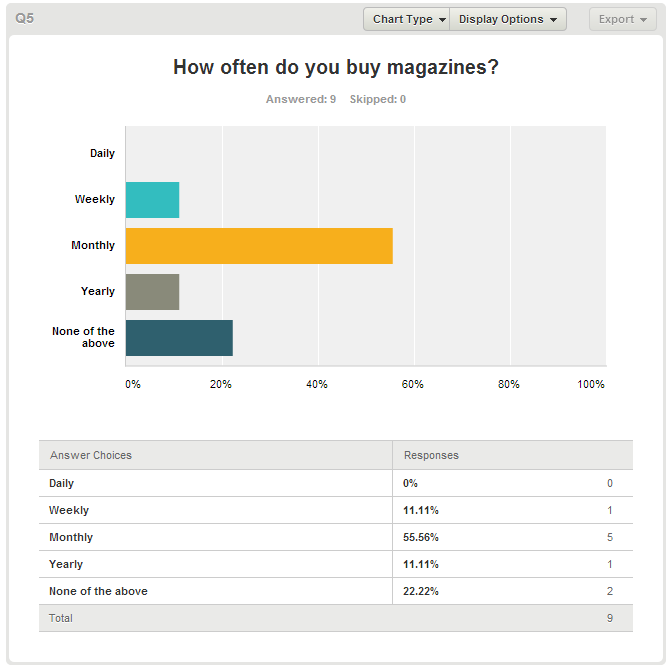
The answers to my question "How often do you buy magazines?" is monthly so I will most likely put somewhere in my magazine that it is a monthly magazine like I might include that with the subscription advertisement.


The answer to my question "What price would you pay for a new magazine?" was £2-3 so with this information so I'm gonna go for a nice number of £2.20 so it doesn't seem too much money for a brand new magazine on the market.

Tuesday, 19 March 2013

Font decision!

I have decided what font I'm gonna have on my front cover and it will be....


I decided Gunship because I think it is a generic font for a dance magazine. It is perfect for my magazine in my eyes!

Monday, 18 March 2013

Font Test - Further Information


These three fonts were the three I decided to use but I will make my decision tomorrow to wish one I want to use on my front cover. I have a lot of thinking to do!

Friday, 15 March 2013

Colour Scheme

Double Page Spread design

This is my design for my double page spread. I have included the big picture that attracts the readers eye and hopefully gives them the feeling like they want to read the article if they like the photo used. I'm going to even include a question and answer format because I prefer this kind of format as I find it easier to read and not think it looks like an essay. I will even include quotes if I need to but I will include one over the photo I think because I think it makes the magazine look more appealing. The title will include a quote and some information about him then I will leave on a cliffhanger so it makes people want to read my magazine even more.

Thursday, 14 March 2013

Contents Page Design!


This is my first design of my contents page. This design includes everything I want to include from my analysis  as I have included the image dominated background and have combined it with the article genre and I think it will look good when I have completed it. I have included some information about the free item because I wouldn't want to waste a page on the free item if I was created the full thing so it makes my magazine look more professional.

Wednesday, 13 March 2013

Font tests


I'm thinking about what fonts I should use for my magazine and I'm undecided about a few fonts. I'm thinking between these and I will probably make my decision based on what I think photos I chose to use because I like the top font but it has to be used with the same context of photos I'm choosing but because the title of magazines don't vary very much, I may not use it if I want to create a follow up magazine.

First front cover design!


This is the first design idea I have for my magazine as it includes everything I want to have. I have included the large photo with the large title as well. I think I have even included  the main articles and many other articles and I think I have made the most of the space I had and when I have confirmed what other articles I will include on the front cover, I will take up a bit more space meaning that their won't be big spaces on the front cover so it will look more professional.